
Designing a leading shopping experience.

Requirements
The marketing and branding team at George wanted to start appealing to a younger crowd, especially those in their twenties and thirties. They decided to use the app to test this new customer base. Even though they already had an Android app, it was essentially a copy of the website. They recognized that by making a "native iOS app," they could better connect with their main target audience and offer a complete shopping experience tailored for iOS users.
George is a true giant in UK fashion retail. Number one for value in the UK, they have 4.5 million active dot com users and a presence in 580 Asda stores. George also directly sells to over 150 countries. And have been reimagining fashion retail since 1989.
My role
UX/UI Design Lead
Product strategy
UI Design & Prototyping
Usability Testing
Create and maintain the Design System.
Understanding the customer


I spoke with customers to get their thoughts on the current George Android App and shopping experience on George.com. The interviews gave valuable insight into what they found frustrating and what features they would like to see.
Observation/Takeaways:
Customers wanted to find items quickly
Fast Delivery times were critical
Would like payment terms - Klarna etc
Used multiple shopping apps - No brand loyalty
Want a proper App experience
Influencers drove buying decisions (Celebs / Friends)
Discount for creating an account

Competitor analysis


In the initial phase, I analyzed fashion rivals' mobile app features and market positions. This involved a detailed review to uncover insights for strategic innovation. By scrutinizing these elements, I aimed to understand their competitive landscape. The goal was to inform strategic decisions and foster innovative approaches within the industry.
I wanted to discover:
What are they doing right that we can learn from?
What are they doing wrong that we can do better?
What rules or practices have been set that we should follow?
I found that most shopping apps use a similar way of navigating. Many shoppers quickly switch between apps to find the right product. I didn't want to introduce a new menu system that would make the buying process slower for the user.
Designing the solution
Personas
I created a persona and referred to it throughout the entire design process. This provided context into a customer's behavior and goals and helped inform the design decisions made.

Low-Fid mock ups
Once I understood our customers, I began crafting a solution. This involved whiteboarding sessions with professional leads and creating low-fidelity mock-ups for team feedback. I mapped out a user flow to guide the app's interaction from sign-in to fulfillment, outlining crucial tasks users need to complete along the way.
I created lo-fid mocks to:
Define the primary and secondary navigation
Key functionality
Quickly share ideas with the team

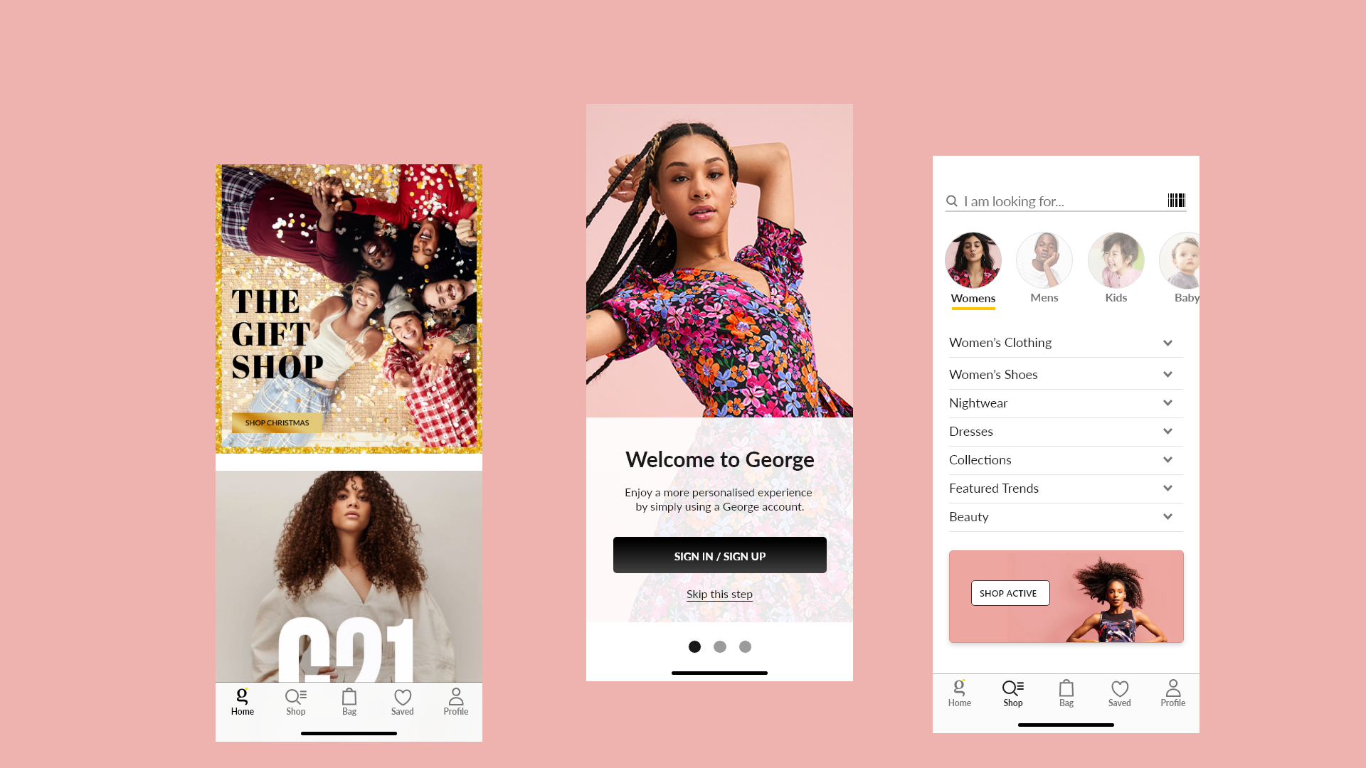
Welcome experience
When a customer loads the app for the first time I want to greet users with an engaging 'Welcome Experience'. I felt that this would set the tone for a 'Joy Filled' shopping increasing customer engagement and helping the customer set up the app for first-time use.
The Welcome experience would also help drive key business goals:
Downloads
Increase Conversion
Increase AOV
Increase Registrations
Retention Rate
Iterations: Navigation
One of the key success metrics was to provide easy navigation, I wanted customers to be able to quickly find the products that they were looking for. Difficulty navigating an app or searching was one of the main causes of abandonment for customers. Customers did not like having to go through multiple screens to find a product.
With the customer in mind, I designed two menu layouts and organized a moderated session with 6 participants. I also arranged an A/B testing session to run for two weeks on the mobile responsive website. The results gave Menu A a clear win, Menu A's consolidation of categories, subcategories, and search functionality within a single screen garnered particularly positive feedback.

In-Store Mode
A new feature for the George App was In-Store Mode. Customers would be notified that they were about to enter a George store and the App would then change to the In-Store Mode setting. This layout was different from the main app as customers would be in a busy environment with many distractions.
In-Store Mode Features:
Store Offers
Scan a Barcode and product reviews/size guides etc
Learn about the Store facilities.
The launch version was an MVP, we did want to include a map that showed your location in the store and what stand products could be located on. For future builds we want to include an Augmented Reality view, a Virtual Assistant, Shop and Go, etc.
Moderated testing
I aimed to gather user feedback quickly to catch any issues with the initial designs, which we could then use to make improvements. We used this feedback to tweak the designs. After that, we did another round of moderated testing to make sure the changes were working and to gather even more insights from customers. This helped us refine our design process and shape our product roadmap based on what our users really wanted.
During testing, I wanted to discover:
Did users prefer static images or a video intro?
Were customers able to complete the welcome screens?
Did customers find the navigation clear and easy to use?
Did customers understand what 'In-Store Mode' was?
Were there any accessibility issues?
What did the user think of the designs and overall experience?

Final Screens


App Store Launch

In just six months, I successfully designed, tested, and launched a new app for George. While we made a compromise by not initially having a fully native app, the positive outcome of a successful launch means we now have the budget to upgrade to a fully native version. This upgrade will significantly enhance the customer experience, reflecting our commitment to continuous improvement based on user feedback and evolving technology.
George at ASDA: Fashion & Home on the App Store (apple.com)
Next steps:
1: Design a fully native app experience
2: Listen to and learn from customer feedback
3: Port the app to Android